01
Web
How a revamp of the John Lewis Partnership digital experience boosted loyalty and sales
Overview
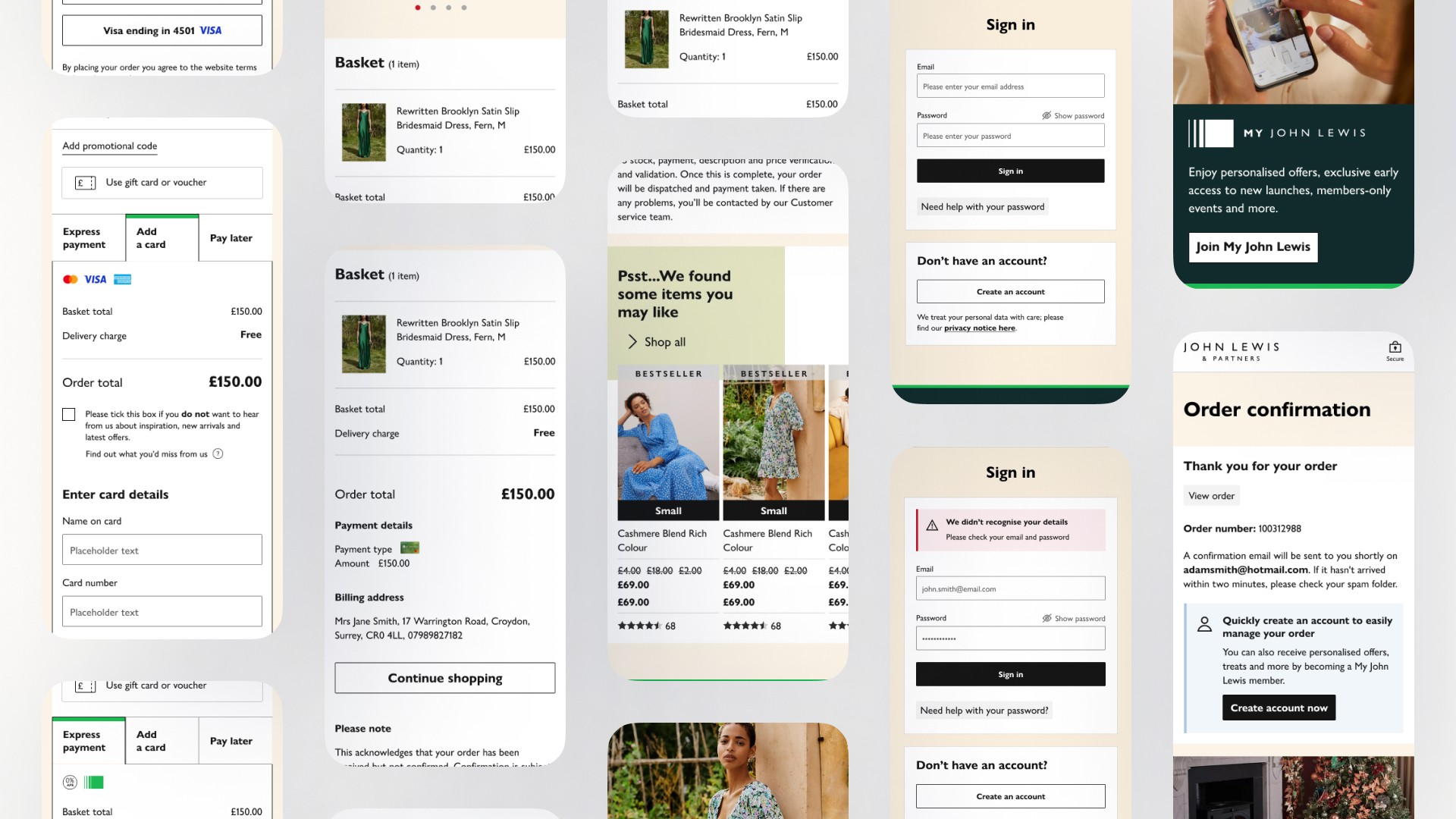
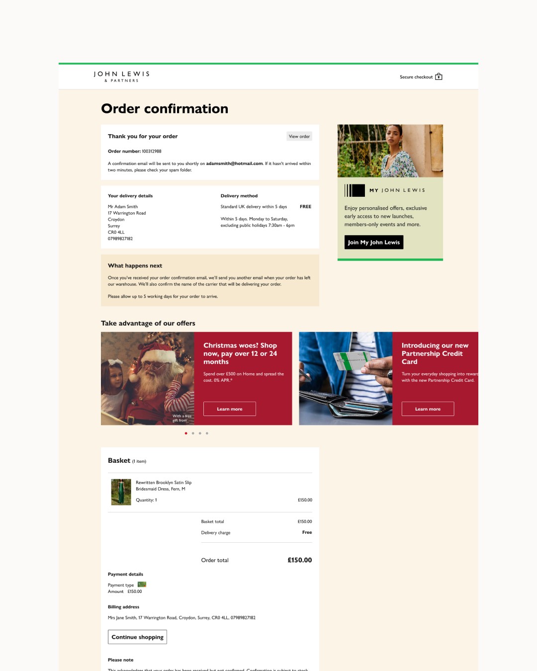
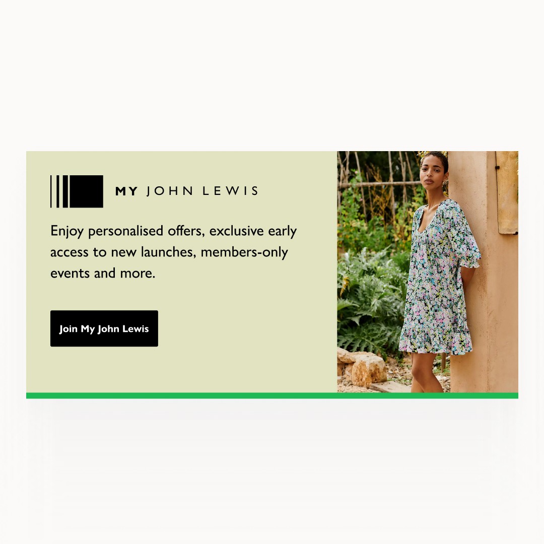
I'm fascinated by how design can transform the way people interact with brands. My work with the John Lewis Partnership (JLP) was a case in point. Their iconic British department store and grocery chain were already beloved, but they wanted to strengthen their digital presence. My mission? Focus on revamping their user flows, updating the sign-in/sign-up experience with their refreshed branding, and optimising the checkout process. Let's dive into the story:
The Challenge: Creating a Seamless Customer Journey
The existing JLP website and app were functional but felt a bit disjointed. Customers faced some friction at key stages: account creation, logging in, and completing their purchases. These pain points translated into lost sales and a less-than-stellar user experience.
Involvement
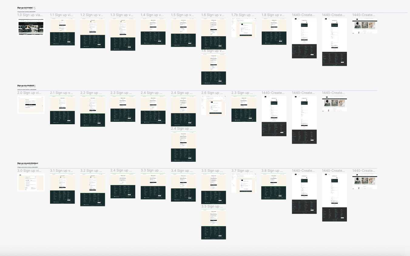
Simplifying the Experience: User Flows Redesigned
We began by mapping the existing user journeys for sign-up, sign-in, and checkout. Through that process, we identified key areas for improvement:
Reduced Clutter: Eliminating unnecessary steps for the sign-up and sign-in process created a streamlined experience.
Social Login: Integrating with platforms like Google to provide customers with quick, convenient option.
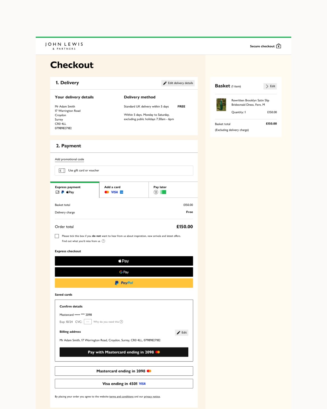
Progress Indicators: A clear progress bar during checkout eased anxiety and kept users informed about their place in the process.
Design System: Foundation for Consistency
As with many large, established brands, maintaining visual consistency across JLP's digital presence was a challenge. A design system became essential. This comprehensive toolkit of UI elements – buttons, form layouts, typography – ensured a unified experience, no matter where a shopper landed. It sped up development time and created a sense of trust for users. Optimising Checkout: Frictionless & Secure The checkout process is make-or-break for retailers. Our focus was twofold:
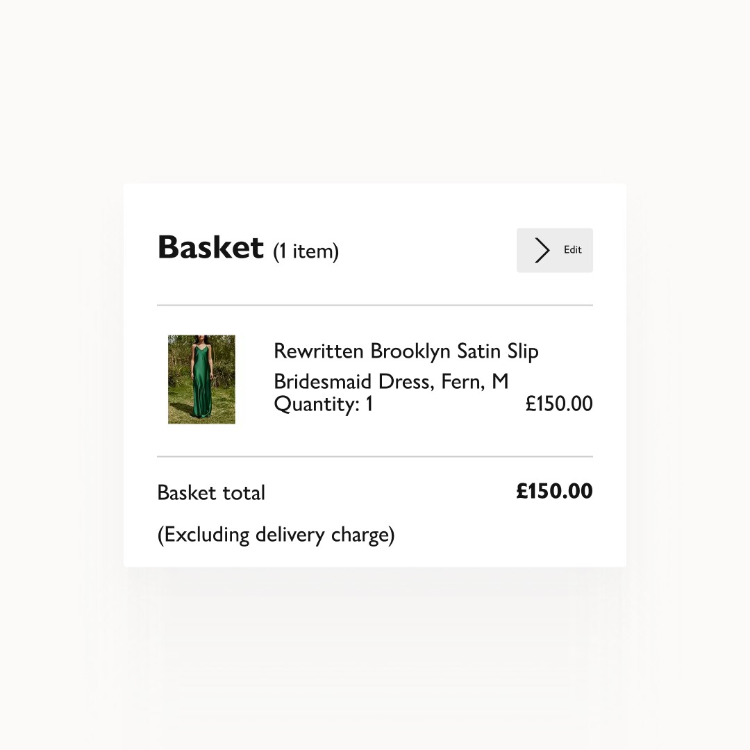
Guest Checkout: Allowing purchases without creating an account removed a major barrier for potential customers.
Intuitive Design: Clear form fields, error prevention, and visual cues helped guide users to a successful purchase.
Conclusion
The Impact: Loyalty and Sales in Harmony
The results spoke for themselves:
Sign-up Conversion: Saw a 18% increase in new account creation, due to easier navigation and social login integration.
Return Visits: Repeat logins improved, thanks to user-friendly design and the option to save login details.
Abandoned Cart Reduction: A decrease of 0% in abandoned carts, a testament to our optimised checkout experience.
The Takeaway: Design with a Purpose
JLP proved that seemingly small design improvements can have a major impact on the bottom line. By simplifying journeys, aligning with brand identity, and focusing on frictionless checkouts, we helped create a digital experience customers love.
Next work
